ZooCards.games
One Photoshop file. One impossible brief. One fully responsive gaming site.

The Challenge
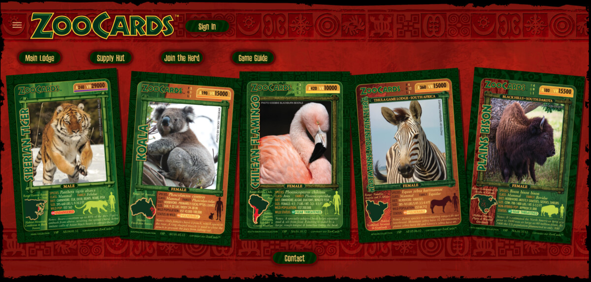
A game developer came to me with a single Photoshop file — a pixel-perfect 16:9 mockup of what they wanted their website to look like. Every tribal texture, every card angle, every ornate border — all baked into one flat image. The art direction was incredible, but it was designed with zero consideration for responsiveness. Oh, and it needed to work on phones.
What I Built
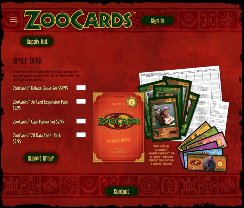
I reverse-engineered the entire visual identity from that JPG. Every texture became a repeating CSS background. Every card became a positioned, responsive element. The tribal borders, the aged parchment feel, the ornate navigation — all rebuilt as real HTML and CSS that scales from a 27-inch monitor down to a phone screen without losing the magic. On top of that, I built a full player login system, an online store with product ordering, and a game guide section.
The Result
A site that makes the game developer's vision come alive at every screen size. Players can browse the card collection, learn the rules, buy game sets, and log into their accounts — all wrapped in a visual experience that feels like holding the actual game box. Try resizing the browser window on the live site — that's the part I'm most proud of.
More Projects
← Back to PortfolioGot Something That Needs Building?
Whether it's a website, a system that won't sync, or an idea that sounds a little too wild — that's my sweet spot.
Let's Build Something Amazing →